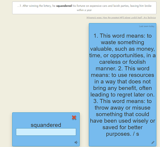
when i add multiple descriptions to the flashcard screen text, it shows all descriptions only one paragraph, is it possible to add line by line. it would be easy to read.
and how about changing the font size in the classic flashcard screen?
Are you inputting these “descriptions” in the alternative translations field, or the synonyms field, or somewhere else? If you could share a screenshot this might help.
for example for this word. there are 3 different context but it show just one.
and there are three different explanation and it show just one paragraph. i cant add in bulletin points format. and as you see, the ui a kinda disproportionate
I see. Thanks for the screenshot. The translation field is only meant to hold a translation of the word/phrase being learned into your first language. Nothing more. So the UI is designed with this in mind. Right now it seems as if you’re trying to learn English without relying on translations, but instead using explanations in English. This is not officially supported.
That said, I’ll consider doing something here, and shrinking the text if it’s very long shouldn’t be difficult, so I may try that.
1 Like
I solved the problem;
by using this chrome extension;
and this code:
#wordCards {
    display: flex;
    align-items: center; /* Vertically centers the child */
}
1 Like
