I’ve just added an “E-Ink” option in the reader page AA tab in the sidebar, here:
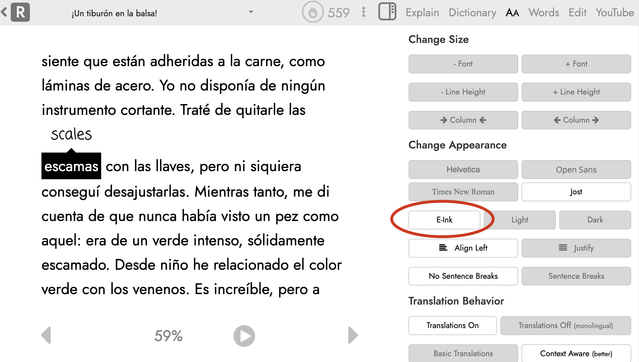
This only applies to the reader page and makes the main text the highest possible contrast: pure black text on a pure white background. It’s very likely that there are certain UI elements I’ve missed and now look out of place in this new color scheme. If you notice anything like this or have other feedback, please let me know!