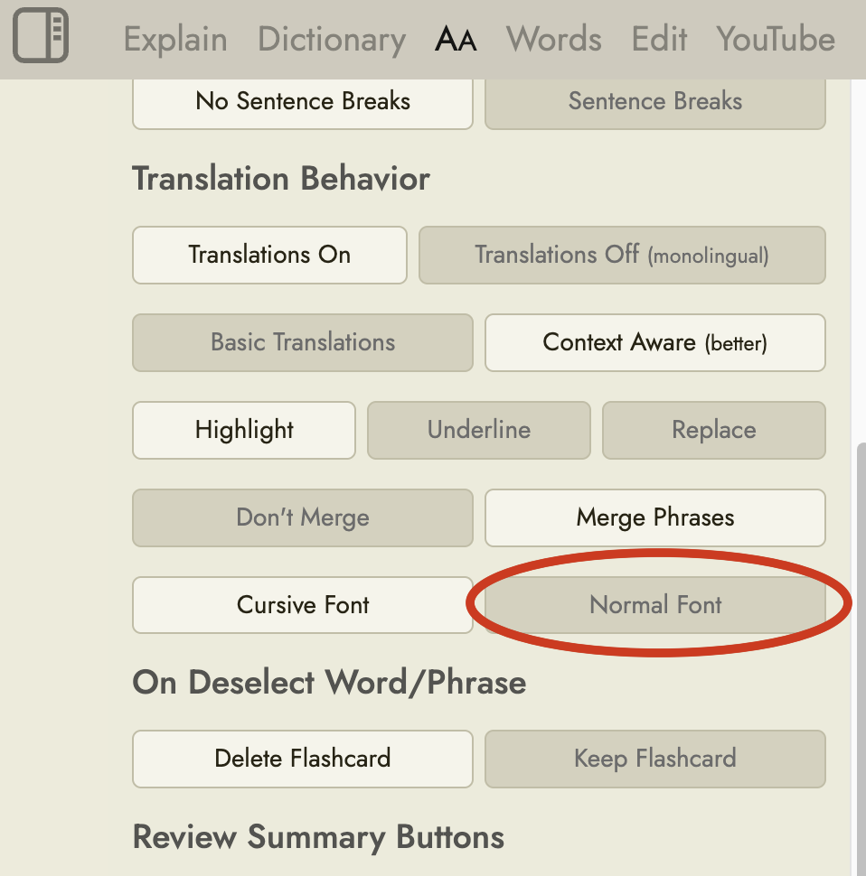
Maybe this feature is already here but I can’t find it: The cartoony font that’s used for the translated word (both in word lists and when clicking on a word) is less than ideal. These kinds of fonts aren’t made for legibility but for a gimmicky look. And while I’m not dyslexic, I find it really hard to parse quickly, harder than normal fonts crafted for long-form text reading.
It would also be interesting to hear feedback from native speakers of non-latin languages. When I’m trying to learn Japanese or Chinese I’m very confused by stylized or comic-style kanji/hanzi fonts, I wonder if it’s the same for e.g. native Japanese readers trying to read a latin cartoon font.
Anyway, it would be great if we could pick our own preferred font there. Or if that feature’s already here, I’d be happy about a pointer to where to find it.
I’ve also just fixed it so that it now applies everywhere, including in the word list and the practice sessions, and it now persists between browser sessions.
I feel bad for following up on this, but in the reader extension, the text that gets replaced in the original page view is still using the comic font. I suppose that’s part of the extension code and doesn’t call back to Readlang to get the settings?
It can be easily worked around by importing the whole page into Readlang but it would of course also be nice to read in the original layout when the page has a pleasing one.
Thanks for adding the “normal” font. I switched to it quite a while ago, but I just noticed that the translation in the explain tab still uses the cursive font.