I bought a tablet specifically to use Readlang more often, but was disappointed to discover that the font size is basically the same on both the phone and the tablet, even on landscape mode!
Specifically, these font sizes:
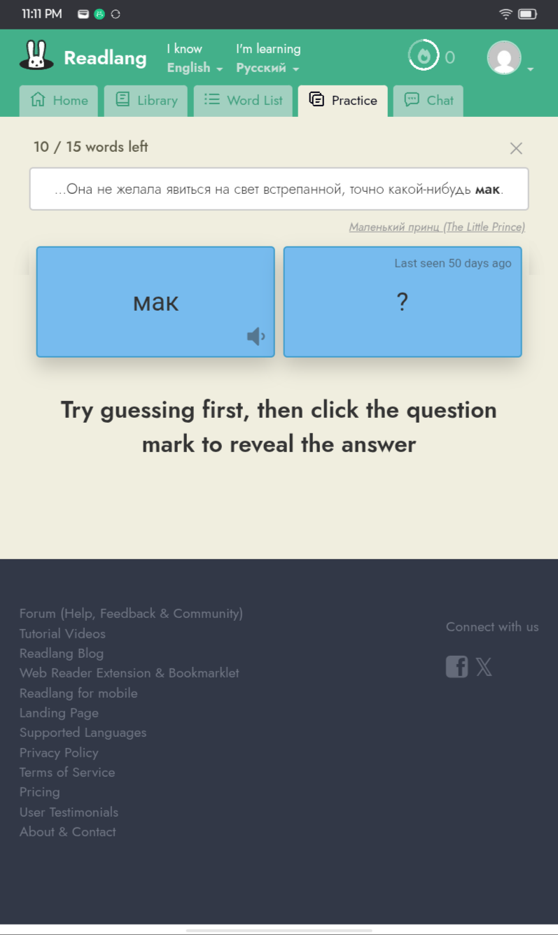
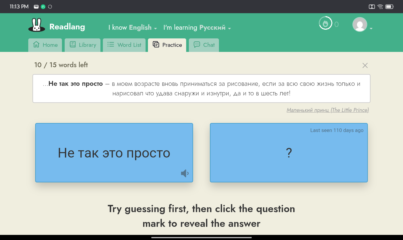
sentences in Practice mode
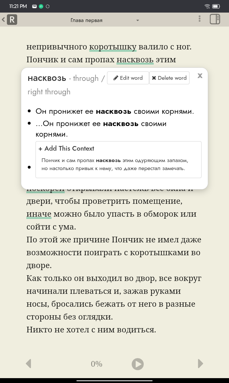
dictionary pop-up when clicking on a word that’s already in the word bank
I’d really appreciate a larger font size for the Practice sentences so that they are easier to read. This is because I’m not just learning the words on the flashcards, but also reading the entire sentence to digest the grammatical syntax. Right now, the words are small, light, and low contrast.
When using Readlang directly in the browser, I can use the Zoom function, but then all the elements enlarge equally which crowds the screen.
Another consideration is to use a black font colour for the practice sentences, and better contrast.
This isn’t an issue for my native language (English) but when I’m reading a foreign language in another script (like Russian), the clarity of the font really helps to absorb it more easily!
Thanks for the detailed suggestions. I’ve just made some changes which should help:
The sentences in Practice mode are now larger and darker, and get larger again on wider screens such as tablets.
The example sentences in the popup for a saved word were previously small and grey. They now use the same size and colour as the main reading text, so they follow the font size you choose in the reader’s Settings tab (“+ Font” / “- Font”).
Please refresh your Readlang browser tab to try it, and let me know how it looks on your tablet.
Thank you for taking the time to understand and improve the experience!
Yes, the example sentences in Practice mode now look slightly bigger with better contrast on the tablet! Also seems clearer on my mobile phone. On a side note, I find it ironical that the font of the instruction "Try guessing first, then click the question mark… " Is so much more prominent and easy to read than the actual sentence we’re trying to learn-I think this clarity is closer to my ideal state as a learner.
The dictionary popup now matches the font of the main reading text. This is much clearer! To clarify, the main focus for me wasn’t the example sentences in that popup (since we’re already reading the actual text), but the dictionary translation - similar to how new words get translated super clearly in that green font. Nonetheless, the current popup is waay clearer overall.
I’ll attach a few screenshots here to show my tablet’s view.
Please could you clarify further since there are explanations in different places throughout the app as well as views of external dictionary websites. A screenshot of this “dictionary translation” that you think could be improved would be handy!